I am working on RITMO’s annual report for 2024. Typically, we include world maps showing where people at RITMO are coming from and the various countries we have collaborators in (check out last year’s report for example). These maps are usually made by hand, but I was curious to see if MS Copilot could help. After a little bit of tweaking, I have created a nice Python script that does the job!
Getting Started
First, you need to install some packages:
pip install requests geopandas matplotlib pdf2image
Then, load the packages we will use:
import requests
import zipfile
import io
import geopandas as gpd
import matplotlib.pyplot as plt
import os
from pdf2image import convert_from_path
from PIL import Image
Downloading Map Data
The map information needs to be downloaded:
# URL of the Natural Earth data zip file
url = "https://naciscdn.org/naturalearth/packages/Natural_Earth_quick_start.zip"

# Download the zip file
response = requests.get(url)
zip_file = zipfile.ZipFile(io.BytesIO(response.content))

# List the contents of the zip file to identify the correct file names
print("Contents of the zip file:")
for file in zip_file.namelist():
    print(file)

# Extract all files named ne_110m_admin_0_countries
files_to_extract = [file for file in zip_file.namelist() if "ne_110m_admin_0_countries" in file]
for file in files_to_extract:
    zip_file.extract(file, path=".")
    print(f"File {file} has been extracted.")
There are lots of files in the zip file, but these should be sufficient for what we are doing here.
Creating the Map
Now we are ready to create the map:
# Path to the extracted shapefile
shapefile_path = "packages/Natural_Earth_quick_start/110m_cultural/ne_110m_admin_0_countries.shp"

# Load the world map shapefile
world = gpd.read_file(shapefile_path)

# Remove Antarctica
world = world[world['CONTINENT'] != "Antarctica"]

# List of countries to be highlighted
highlighted_countries = [
    "Argentina", "Australia", "Austria", "Belgium", "Brazil", "Canada", "Chile", "Colombia", "Denmark", "Egypt", "Finland", "France", "Germany", "Iceland", "Israel", "Italy", "Japan", "Jordan", "Mali", "Mexico", "Netherlands", "Poland", "Portugal", "Spain", "Sweden", "Switzerland", "Turkey", "United Kingdom", "United States of America"
]

# Create a column to indicate whether a country should be highlighted
world['highlight'] = world['NAME'].apply(lambda x: x in highlighted_countries)

# Plot the world map
fig, ax = plt.subplots(1, 1, figsize=(15, 10))
ax.axis('off')  # Remove the border around the plot
world.boundary.plot(ax=ax, color='none')  # Remove land borders
world.to_crs("+proj=wintri").plot(ax=ax, color='#5cD0D6')  # Winkel Tripel projection
world[world['highlight']].to_crs("+proj=wintri").plot(ax=ax, color='#014E61')

# Adjust layout and save the plot as a PDF file
plt.tight_layout()
plt.savefig("map_world1.png", bbox_inches='tight', pad_inches=0)
plt.show()
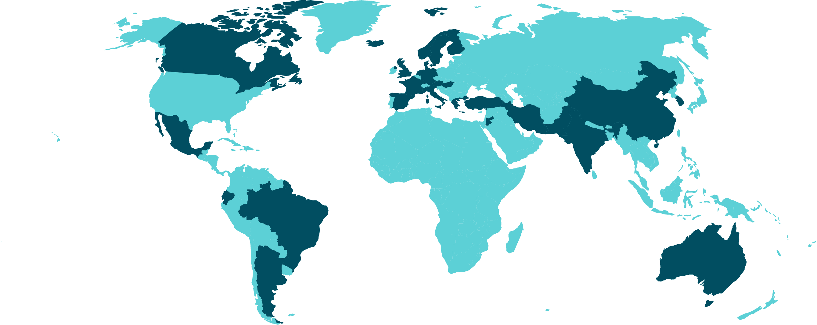
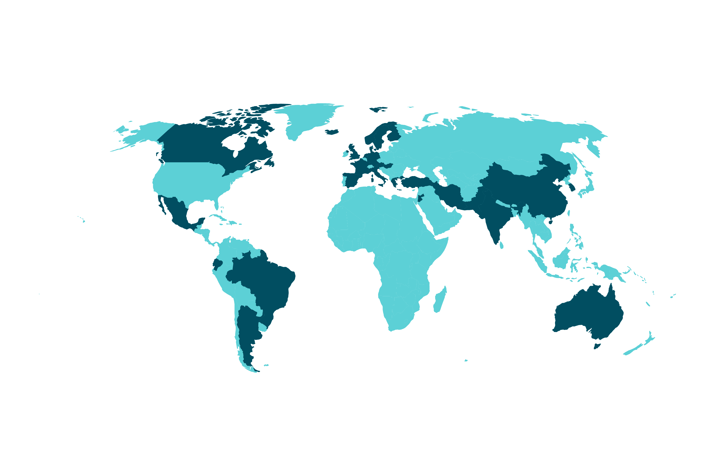
The result looks like this:
I removed Antarctica because it didn’t contribute any meaningful content in this context.
Projections
The first map I made didn’t look right, and I realized that it was because of the projection. So I have explored some different projection options.
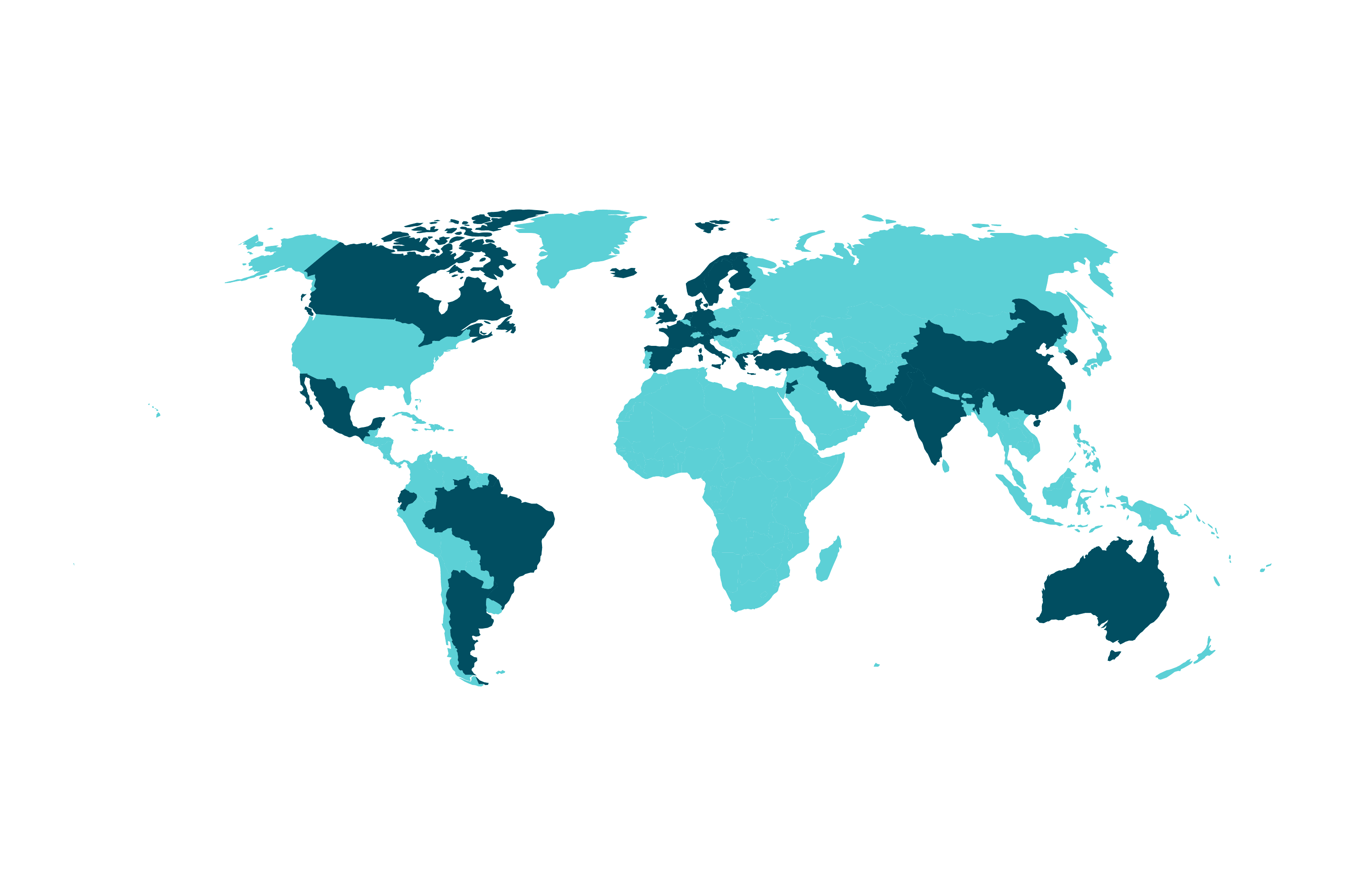
WGS84 Latitude-Longitude Projection
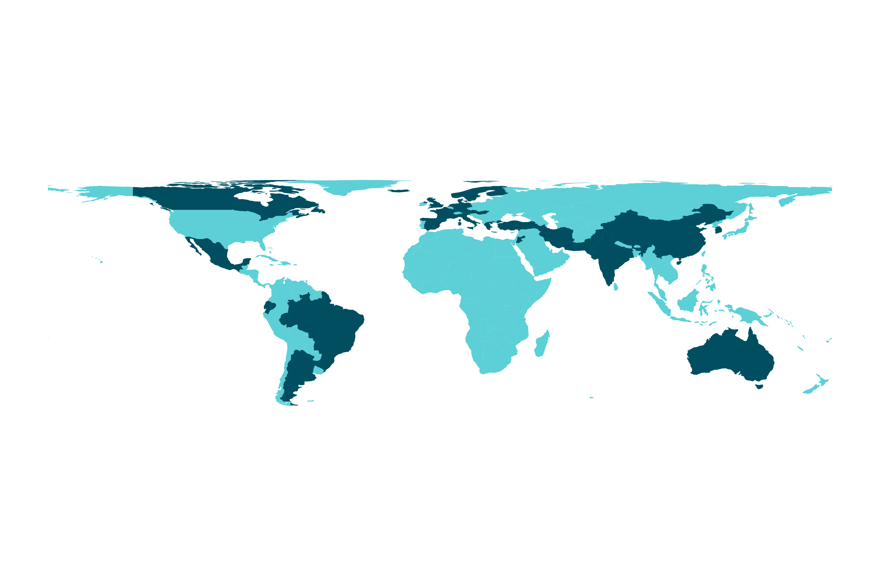
The standard projection used by the GeoPandas library is called the WGS84 latitude-longitude projection, referred to using the EPSG code 4326. This projection represents coordinates in degrees of latitude and longitude, making it a common choice for global datasets. This is what you get if you run the above code without any projection:
world[~world['highlight']].plot(ax=ax, color='#5cD0D6')
world[world['highlight']].plot(ax=ax, color='#014E61')
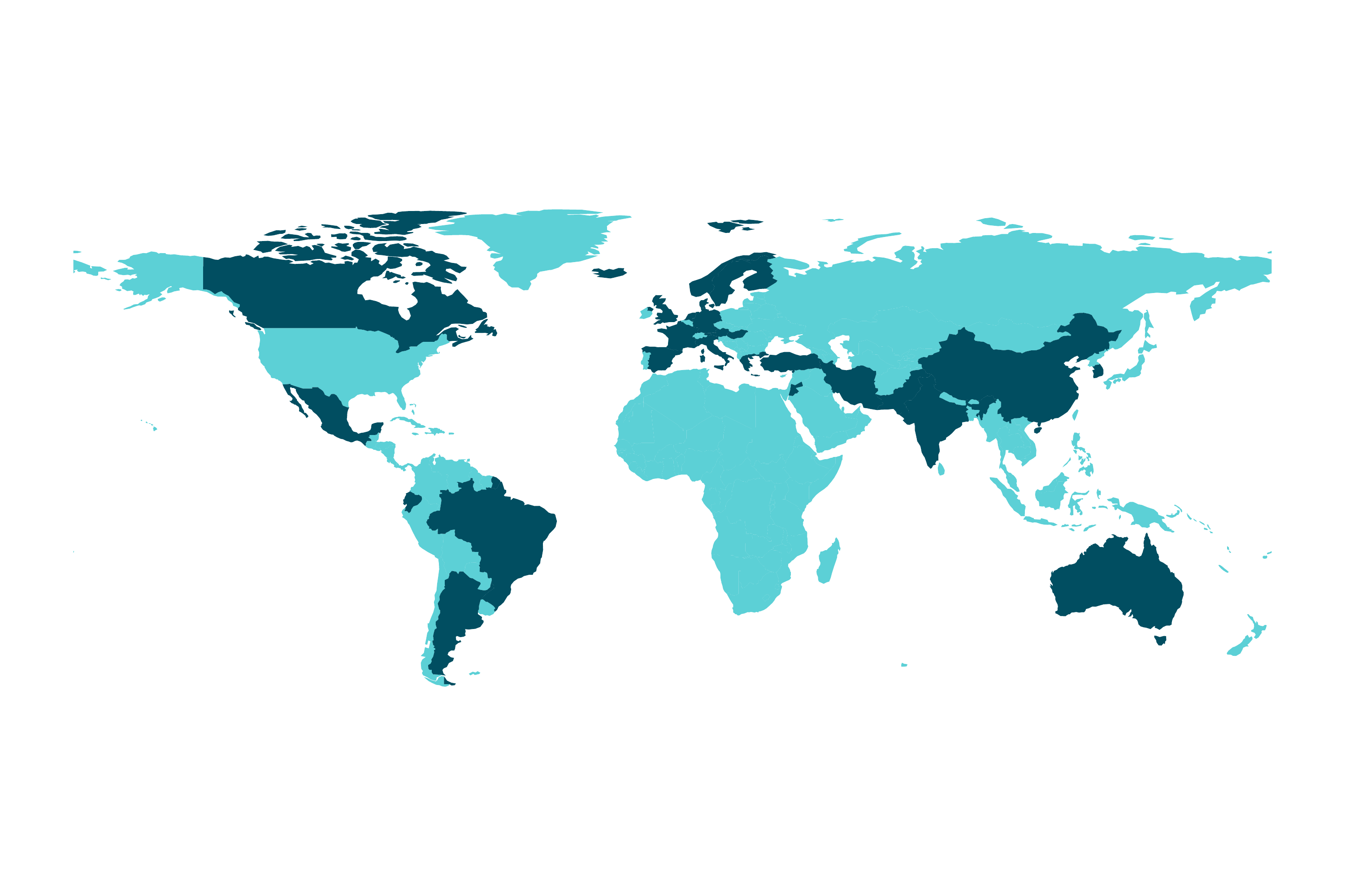
Mercator Projection
The Mercator Projection preserves angles and shapes of small areas, making it useful for navigation. However, it distorts the size of landmasses, especially near the poles, so Greenland appears much larger than it actually is compared to Africa.
world.to_crs(epsg=3395).plot(ax=ax, color='#5cD0D6')  # Mercator projection
world[world['highlight']].to_crs(epsg=3395).plot(ax=ax, color='#014E61')
Robinson Projection
The Robinson Projection is a compromise projection that minimizes distortion in size, shape, and distance, providing a more balanced view of the world.
world.to_crs("+proj=robin").plot(ax=ax, color='#5cD0D6')
world[world['highlight']].to_crs("+proj=robin").plot(ax=ax, color='#014E61')
Gall-Peters Projection
The Gall-Peters Projection is an equal-area cylindrical projection that accurately represents the relative sizes of countries, although it may distort their shapes.
world.to_crs("+proj=cea").plot(ax=ax, color='#5cD0D6')
world[world['highlight']].to_crs("+proj=cea").plot(ax=ax, color='#014E61')
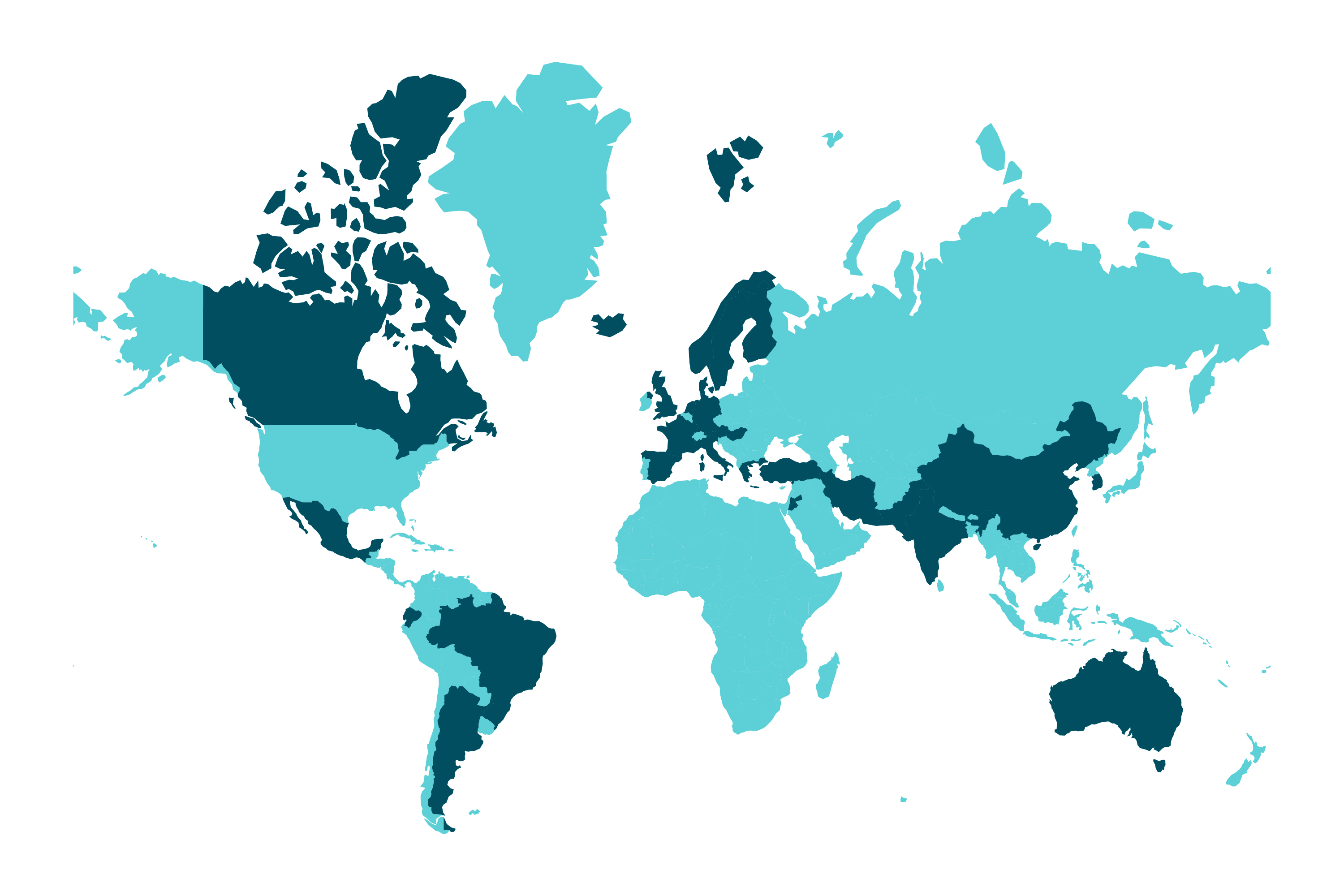
Winkel Tripel Projection
Ultimately, I found the Winkel Tripel Projection to look most similar to our previous maps. This projection minimizes distortion of area, direction, and distance, providing a good overall balance. However, like the Robinson projection, it does not preserve any specific properties perfectly but offers a visually appealing compromise.
world.to_crs("+proj=wintri").plot(ax=ax, color='#5cD0D6')
world[world['highlight']].to_crs("+proj=wintri").plot(ax=ax, color='#014E61')
Conclusion
Before starting this project, I didn’t know much about map projections. I didn’t even consider the option of making maps programmatically. It turns out that it was much easier than expected. Hopefully, this blog post can inspire others to do the same.