I have been using a Fitbit activity tracker over the last couple of months, which has been an exciting experience, and which has triggered me to move more than I otherwise would.
 For some new experiments we are going to run in the lab, we have bought a bunch of AX3 sensors. These are small accelerometers with long-term storage ability (~30 days of 100Hz recording!), and of course, I wanted to test out how they work. So I strapped on five of them and kept them on for 24 hours. This was not a very exciting 24 hours in my life, running from one afternoon to another, with me sitting in my office during the daytime and just being at home the rest of the time. So this analysis is only based on my interest in testing out the device, trying out the analysis methods that they suggest on the Axivity site, and finally getting to try out the plotting capabilities of the new web-based analysis tools plot.ly.
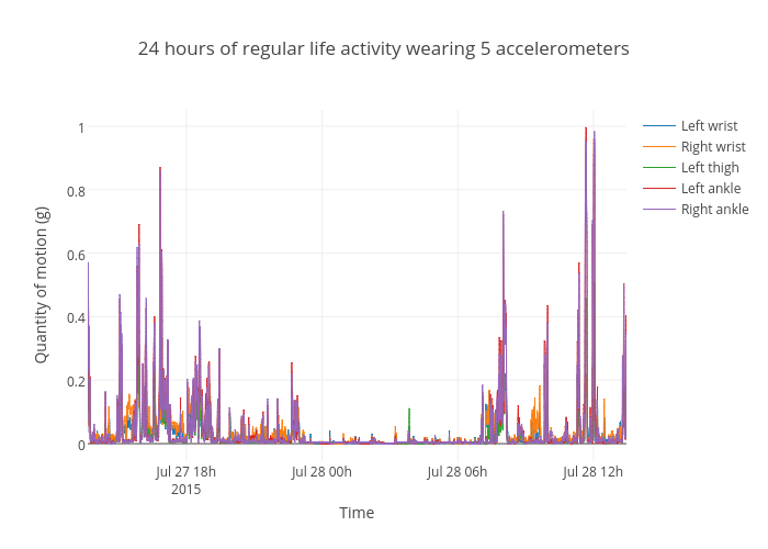
First I am starting by looking at a plot of what Axivity calls the Signal Vector Magnitude, which is often also called the norm or the length of the XYZ vector, independent of the activity in each of the axes. This is what I would typically call quantity of motion (QoM), to have a generic term to describe activity independently of the sensing technology used.
[](https://plot.ly/~alexarje/73/ "24 hours of regular life activity wearing 5 accelerometers")
One nice thing about plot.ly plots is that they are interactive, meaning that you can click on the legends in the plot above to turn on and off the different accelerometer plots. The next basic analysis step in the Axivity manual is what they call cut-points, which is a segmentation of the data stream into four different activity levels:
- sedentary
- light
- moderate
- vigorous.
These categories are derived from the Metabolic Equivalent of Task (METS), which is defined by Wikipedia as:
“the energy cost of physical activities … defined as the ratio of metabolic rate … during a specific physical activity to a reference metabolic rate”.
Interestingly, the plot of my activity during the 24 hours, show that my biking back and forth to the university is considered “vigorous”, while the rest of the time I moved little.
This fits quite well with what my Fitbit can tell me (only screenshots available there, unfortunately):

It is somewhat tricky to see the different activity, so here is a boxplot with a logarithmic y-axis, so that it is possible to see what constitutes the most activity.
As could be expected, the arms are moving the most. And the right arm is moving a little more than the left. It will be interesting to delve deeper into the data in the future!

